
Chart Types – Basic Way to do an Insightful Data Visualisation
Plain numbers and characters are the measures that can help a company unfold various patterns hidden for a long time. These patterns can also be helpful for efficiently executing different tasks such as stock management, finding bestselling products & loyal customers, customer retention, and more customer acquisition. For effective performance of these tasks, there is a necessity for exploration, manipulation, presentation, and visualisation to find the insights or “Lucid Insights.”
Therefore, it is crucial to explore the data and use extra steps to get meaning from it effectively. Data can be diverse, such as company sales and budget, bank transactions, and medical data.
So, before we dive in deep, there are a few questions that need answers before we start processing this data:
- Who is our audience?
- What may our audience need?
- How can we achieve the desired results?

Knowing the audience is one of the first steps before diving deep and analysing the data. The audience could be managers, CEOs, students, teachers or other professionals. A company CEO may like to know the brief from the data, which could summarise all departments, while a stock manager would like to go to in-depth particulars concerning the stocks that need to be kept. This requirement varies from the audience which we are targeting. It is critical to know what the audience would like to get their hands on. The audience’s viewpoint comes with essential factors when creating the visualisation. The absence of considering these viewpoints can lead to drastic effects, and even a beautiful visualisation with much analysis could go to waste.
Once we have identified the audience, it is critical to know what they want from data; as we mentioned, a CEO may need a brief while the stock manager could only be concerned with the specific data. It is vital to think from the end user’s viewpoint to create visualisation as it could pass the ease to the user to perform daily tasks. The audience must get to the story you are trying to convey from your visualisations, and each chart should communicate that meaning. With different audiences comes the need for varying visualisation to fulfil that need. Microsoft Power BI offers ways to obtain the desired results by providing numerous visualisations such as stacked charts, histograms, pie charts, line graphs, maps.
Different charts can help to discover additional insights and reality to the end-user. It is of utmost value to convey the story precisely to achieve the desired results. It is essential to understand what each chart can provide to the user to uncover different meanings effectively. We have summarised some of the methods which can be valuable to you when creating a data visualisation by yourself.
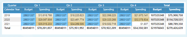
Tables
Tables are helpful in presenting detailed data in rows and columns effectively. Although these can help deliver the data effectively in a structured format, they lack a visual highlight compared to other charts.
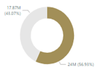
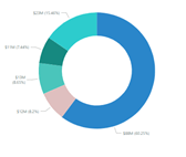
Pie charts
These charts are easy to find the difference between categories. They can be good to use with few categories, but as the number of categories increases, it loses the main sight to provide the differences in those categories effectively.
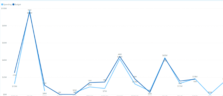
Line Charts
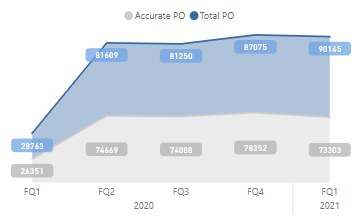
These charts help provide the time variation in our data, which can help us figure out how a product sells over time. They can quickly help us identify the variation in our two data features.
Heatmaps
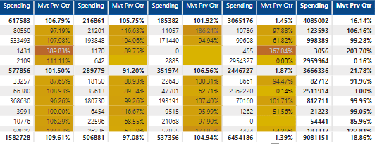
Heatmaps help identify the difference in data using the variation in colours. The variations depend upon the values belonging to that field and are darker or lighter to signify the values.
Bar Charts
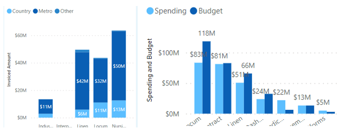
These charts can be handy to find the variations in two or more categories concerning another variable. The bar charts can be stacked or clustered again, counting on the requirements.
Cards
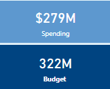
Cards come in especially useful to highlight a single number out of your visualisation. These numbers can vary depending upon different variables and can change accordingly. For example, cards highlight the spending and budget numbers when combined with another visualisation.
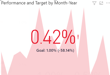
KPI Cards
These visualisations can help to explain the overall story of all visuals in terms of two specific parameters. An example could be the overall story of the actuals and budget of a company. These visuals come as the traffic lights to describe which direction we are heading, where red represents danger and green as good.
We can also use many other charts to convey our story, and Microsoft Power Bi offers the chance to download more visuals. In the end, it comes as art to how we can use visuals and charts to convey our story. We hope this could help you get a basic idea and functioning of different charts and give a better treat to your audience.
Are you interested in knowing more about it?
Let’s talk, we can help you!
Check out the Lucid Insights blog
There is a variety of content that may help you to improve your business!